Every business needs to evolve to stay relevant. Because businesses undergo a transformation and enter new phases of growth, venture into brand new sectors, their brands have to be changed as well.
A creative branding agency can offer valuable advice and guide the process of change.
But as a business owner, how do you let customers and other stakeholders know that your company is on a journey of transformation?
You can’t shout from the rooftops. You could, of course, announce it on social media and your blog. But that reaches only a handful of die-hard fans, even for enormous brands such as Tesla and Nike.
The only remaining way is to go for a logo transformation.
5 signs your logo needs a revamp
1. It looks old
How can a logo look old? A logo is just a design, maybe with a few alphabets.
Wrong, wrong, and wrong.
A logo represents a particular culture and an era. I assume you have seen a copy of The Bible.
Was it handwritten on parchment by monks wearing a dark cassock?
No.
I am willing to bet at least one you saw was from Gideon. It was a small neat pocket-sized weighing a few ounces and clad in imitation leather with a readable font such as Concord or Times New Roman.
Everything changes to match the times we live in.
The same with logo designs.
Modern fonts don’t have a lot of curls and corners. They are remarkable in an unremarkable way.
The Google logo has gone from Baskerville Bold to Catull to the current flat typeface in the space of 15 years.
![]()
As the company branched out from being a pure search service into internet advertising, video streaming, emails, storage, and maps, the older, more voluminous typefaces were replaced by very efficient-looking ones.
What type of logo change do you need? Of course, you can’t judge that. Being a part of the business, there is no objectivity in your judgment. The task is best done by a creative branding agency.
Not only do experts have a better understanding of the customer, but they also have researched what works and what does not.
Read More: The cost of logo design services: is it worth the investment?
2. The story is irrelevant
A logo is not just a scrambled platter of fonts, shapes, and colors. It is supposed to tell a tale and appeal to the customer’s subconscious.
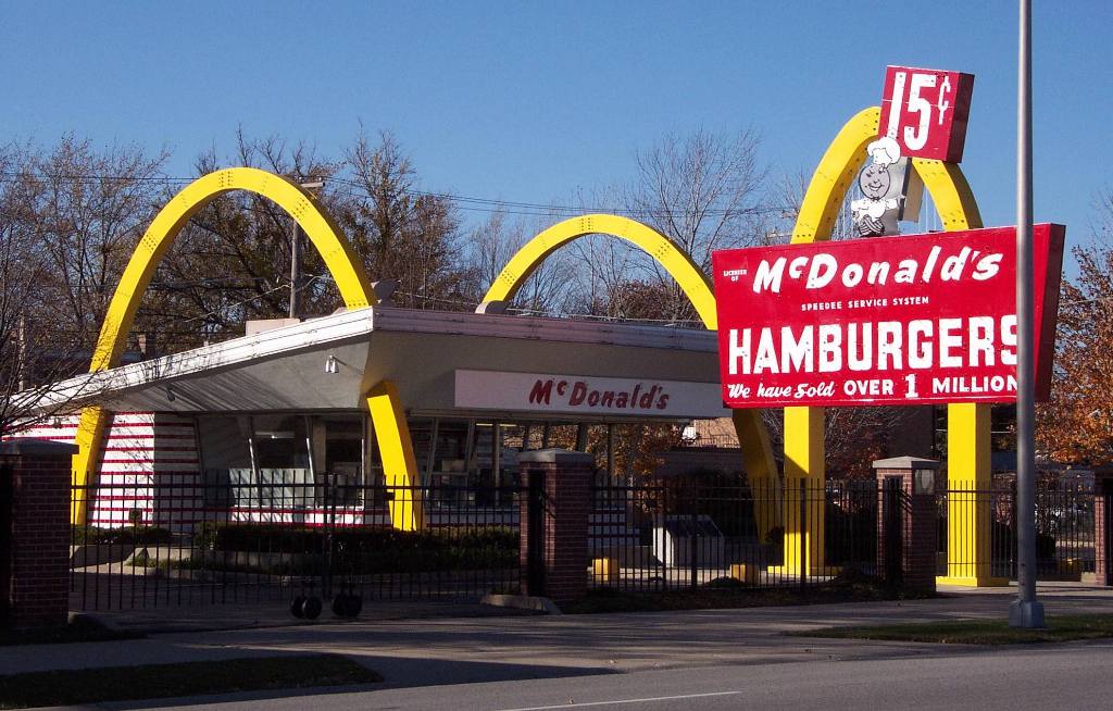
The McDonald’s golden arches, widely thought of as the most influential logo of all time, are interpreted as mother’s breasts and therefore a sign of stability. The yellow on red is soothing. It is instantly recognizable from a block away.
A logo has to tell the story of how the company has changed. That did not matter with McDonald’s because neither its product mix nor the franchisee formula has changed in the past 60 years.
That is not true for any other business as far as I can tell. Even a staid old petroleum giant like Shell has had to go for a couple of complete redesigns in the past century.
Making the logo tell that story is another matter altogether. One has to dive deep into the psyche of the average person and discover what stirs him and makes him tick. A brand strategy agency can do that effectively and without a lot of wasted resources.
Read More: Branding is an investment, not an expense, here is why.
3. It was a fad (once upon a time)
Maybe your old logo is in Lucida Handwriting.
Back in the end 90s, we were all feeling warm and cozy. Titanic and the tragic story of Jack and Rose were the talk of the town. A new millennium was on its way. The Iron Curtain had crumbled and there was a lot of optimism.
Now in 2022, after a couple of economic downturns in 2001 and 2008, a pandemic that has taken the lives of at least 7 million, almost 20 years of ceaseless wars in Afghanistan, Iraq, Syria, and now Ukraine, we are weary. Global temperatures are reaching record highs, wildfires sprouting everywhere, and rampant unemployment has hit most economies.
Lucida Handwriting does not represent the zeitgeist (that’s German for the spirit of our times).
Perhaps a new libre sans typeface such as Montserrat would be a better match for the mood of your customers.
4. Is it analog design?
Maybe you did it yourself. Perhaps you hired an artist.
Did the process use digital tools such as Adobe Illustrator?
If not, go for a revamp, of course.
Why do I say so?
You can use top-notch software such as Illustrator to change colors in the blink of an eye, resize and crop.
Turn the image upside down or make the last letter a little larger, change the hue and saturation—it takes no time at all.
You can’t do the same the old-fashioned way. The artist would need an afternoon to scale a design up and down from a 240 by 360 grid to a 200 by 400 grid. and another afternoon to change every color to slightly bluer. You get the picture, I hope.
Digital design is by far superior and if you have not used it, I strongly suggest you incorporate technology.
5. You did it yourself
That is not a crime. Nor an act of foolishness.
You were starting out and had little to spare. So you put together what you thought looked appealing using MS Paint on your brother’s laptop.
It worked well, and your business grew. Now it is time to change and go for something better.
An expert has a far superior idea of what would be appealing and memorable. After all, if it cannot generate recall, why have a logo? If there is no story, no emotions, why have it at all?
Because you work in your niche (no offense, Mark Zuckerberg is in his own niche too) you cannot have an idea about what people at large want. specialization has its advantages, but it also creates a blinkered vision.
If you checked any of the boxes above, it is time to place a call to a logo design agency.
A good one would guide you not only through a logo redesign but also on how to market it effectively.