
A 2021 study by Top Design Firms concluded that 50% of users feel that website design is a crucial element of a brand’s overall identity.
That means your website visitors are judging not just your site, but your business based on the design.
But most business owners consider website design an expense.
In reality, however, it is a very effective investment. And an investment that your audience wants you to make.
In a survey by Top Design Firms, 50% of customers said businesses should prioritize web design.
Web design is no simple feat though. Mistakes happen.
And these mistakes can be costly for your business in the long run.
That’s why it is important that you consult an expert website design agency.
Moreover, here are some common web design mistakes and helpful tips on how to avoid them. Read on and save your business image and website conversion rates.
1. Lack of a clear CTA
When a visitor lands on your website you want them to take some action, right?
You could want them to:
- Buy a product,
- Request a quote,
- Schedule a meeting/consultation,
- Share the page on social media,
- Subscribe to your newsletter, or
- Visit another page to read more.
No matter what you want users to do, it is important to make it clear.
And that’s done through calls-to-action.

While it is seemingly obvious, most businesses miss placing clear and relevant CTA during web design. That’s why 70% of B2B websites lack CTAs.
While designing each page, zero in on what you want the user to do on the page. Once you know what action to solicit from your audience, craft a clear, attractive CTA and place it on your website ( as a button or as anchor text).
2. Inconsistent designs
Your website is an integral part of your brand identity.
While you may be tempted to play with colors, explore different fonts, and unleash creativity while designing your web pages, hold your horses.
Your website design needs to be consistent across pages.
Consistency is also important in terms of what your users expect. People visit several sites on the Internet. And they expect some things to remain consistent across brands.
For example, most users will expect to see the brand’s logo in the top left-hand corner. Now, if your website has a logo on the right-hand corner or the center it reduces brand identity recall as noted by one expert UX publication.
Thus, while standing out is important, staying consistent with some industry standards and across your entire website is equally important.
Read More: 5 signs it’s time for a website redesign
3. Annoying pop-ups
Popups have an average conversion rate of over 11%.
That means, if used right, these can not just help you build your email lists, but also increase conversions and engagement.
But most users hate popups.
70% of Americans, for example, said in a survey that they get annoyed by irrelevant pop-up ads.

The key point to be noted here is – relevance.
Relevant pop-ups = higher conversions
Irrelevant pop-ups = annoyed visitors
Two rules of thumb while adding popups to your site’s design:
- Use pop-ups sparingly, only when needed.
- Offer value (discount, information, freebies) through pop-ups.
4. Unintuitive navigation
Unless you have a single-page website with infinite scroll, you’d want your visitors to go to different pages on your website, right?
And without intuitive navigation that ain’t gonna happen.
What happens when people don’t know where they are on your site or how can they reach the page with relevant information?
They will leave your website angry and frustrated. And never return.
Here are three golden rules for designing intuitive navigation for your website:
- Avoid dropdown menus. Simple menus work better.
- Limit the number of items in any navigation menu to 7.
- Make sure your users know where they are on your website using breadcrumbs.
5. Boring 404 pages
A 404 page is used to tell your visitors that they have reached a page that doesn’t exist.
Ideally, there should be no need for 404 error pages. But pages move and content gets removed from one page and added to another. Thus, there is a need to have a 404 landing page ready.
But most website designers don’t put in much effort while creating a 404 page.
If done right, these pages can help you win back a potentially lost audience. Funny, witty, and sincere 404 error pages, in-sync with your brand voice can make people laugh, improve their mood, and make them give you a second chance by visiting another available page.
6. Thin content
Content is an extremely crucial aspect of your website’s design. It helps keep visitors engaged. And also boosts SEO with the use of the right keywords.
But many websites, especially eCommerce sites, suffer from the problem of thin content. It is a situation when your website has content that offers no value to visitors. And Google penalizes websites with thin content.
How can effective web design fix thin content?
While designing your website architecture, make sure every page has something to say. Clubbing two related pages with limited content together can be helpful.
However, make sure you don’t overpopulate your web pages, which is another web design flaw…
7. Extremely populated pages
Adding too many images, too much content, and a lot of CTAs on a single page can confuse the readers.
Without adequate white space, users won’t be able to find what they are looking for. And all the information that you put up on your site will go unread.
Here’s an example.
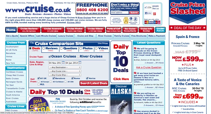
Now you don’t want your website to look like that, right?
So, while designing any web page:
- Ensure a structured page layout
- Have adequate white space
- Use images as and where necessary
- Talk to the reader, but don’t blabber on with unnecessary content.
8. Multimedia malfunctions
Images and videos can have a great impact on your website’s retention and conversion rates.
But:
- Unoptimized multimedia files on your website can also slow it down.
- Overuse of generic stock pictures can make your website look unattractive.
- Low-quality images on websites create a negative brand image.
- Too much multimedia content can distract users.
However, the solution isn’t too hard to implement either:
- Hire graphic designers to create custom, high-quality images and videos for your brand.
- Always optimize the multimedia content on your site.
- Use images and videos with proper spacing.
9. Unresponsive design
4 out of 5 customers shop from their smartphones.
And more than 50% of website traffic comes from mobile devices.
That makes it clear that creating a website with just the desktop view in mind is a grave mistake. Unresponsive site design not just diminishes your site’s look on other devices, but also deteriorates your brand’s image.
To avoid that, always avail responsive website design services. And use a responsiveness testing tool before making your website live on the Internet.
10. Not hiring experts
Just because you read about color theory online doesn’t make you an excellent artist, right?
And simply because you read through a web design guide, you don’t become well equipped to design your business website.
Not hiring experienced professionals to save some cash is one of the biggest mistakes that businesses (especially SMBs and startups) make.
Without expert web designers, creating a flawless website is practically impossible. And also unviable given that you’d have to spend your time on website design, which you could have spent on serving customers and boosting your business.
So make sure you hire a website design agency to carry out the website design job.
Don’t let web design mistakes ruin your website’s conversion rates
You now know the most common web design mistakes and also the ways to avoid them. What remains is for you to start acting on the advice.
Begin your mistake-free website design process today.

