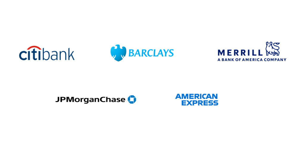
JP Morgan Chase, Merrill Lynch, American Express, City Bank, Barclay’s, and many other financial organizations have blue logos.
Coincidence? Not really.
The choice is rooted in color psychology.
Most people associate blue with trust and reliability. And these financial organizations want people to trust them.
That’s why by using blue as the prominent color in their logos and overall brand identities, they try to gain public trust.
And these organizations do have our money, so it is safe to say that their tiny little trick worked. That I believe renders moot the oft-asked question – “Do colors matter in building a brand?” or “Do I really need branding agency services?”
Now let’s think about another blue brand. Say, Facebook.
![]()
Do you trust Facebook with your data?
I don’t.
And neither do 72% of people in a 2021 survey conducted across a random US sample of 1122 adults. People trusted red YouTube, green WhatsApp, pink-toned Instagram, and black-based TikTok more than blue Facebook.
So the people who trusted blue banks with their money, don’t trust a blue social media platform with their data. Bizarre, isn’t it?
Well, that definitely means that using colors for branding needs proper thought and effort. (And color-based branding isn’t all it takes to solicit audience emotions!)
Thus, the question you should now be asking is – “How to unlock the power of colors while branding my business?”
Now that you are asking the right question, let me walk you through the answer.
Read More: Top 3 dos and don’ts of logo design for Startups
How to bank on the power of colors in your branding efforts?
People will forget what you did for them. But they’ll always remember how you made them feel. This stands true for businesses too.
And colors have a powerful effect on moods and feelings.
So the right colors can help you evoke and enhance the right feelings among your audience. And potentially enhance your bottom line too.
Let’s consider an example.
If yours is a gift shop, red would be an ideal color. It would make your audience feel the love and passion. Two emotions are prerequisite to making someone shop for gifts.
But isn’t red also associated with danger? What if red scares away your customers by instilling a feeling of caution?
The solution?
Understand your audience
That’s step 1 to unlocking the power of colors.
Color psychology is not an exact science. People can have different reactions related to different colors based on their individual reasons.
So understanding that purple gives off the feeling of royalty is not enough.
You need to understand how purple makes your audience feel.
And you’ll understand that only when you understand who your audience is.
Gender, age, income range, personality, culture, social upbringing, and many other factors affect color preferences. Once you know your target audience, it won’t take you long to find studies and actual research-based data about the color preferences of your audience.
Once you have that data, leverage it to pick a core color for your branding activities. And stick to it. But…
Consider your competitors too
Color theory isn’t new. People (read: your competitors) have been using it for a long time. If you think green will benefit your eco-friendly brand, you aren’t the first one to have arrived at that conclusion.
Chances are that many other businesses in your line of work have green-toned logos. Your green logo would get lost in the crowd.
To avoid that, start by analyzing the brand colors of your major competitors.
What colors and combinations are they using and what’s the people’s perception about their brands. That will give you two insights for bettering your branding.
One, what combinations have already been used and you should avoid.
Two, what combinations don’t have the intended effect and thus, you should avoid.
So now you have two things finalized.
- The core color for your brand, based on your audience.
- The combinations to avoid, based on competitor analysis.
That leaves you with about a million options for potential combinations.
Do you have to test all of them? No.
Experts have zeroed in on 4 basic ways to find an aesthetic color scheme. So…
Pick your brand’s color scheme
… based on one of these 4 color scheme options.
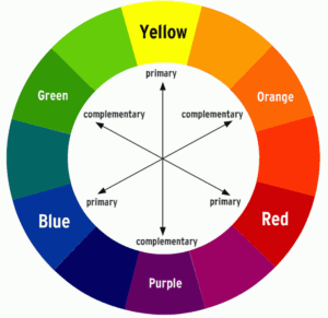
1. Analogous – Includes the colors on the right and left side of the core color in the color wheel. Such combinations are great for maintaining consistency and avoiding distractions.

2. Complementary – Includes the colors placed directly opposite to the core color. This type of combination instills a sense of balance and eye-catching contrast.
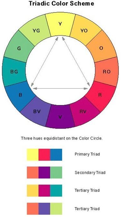
3. Triadic – Includes 3 colors that make a sort of triangle on the color wheel. With your core color pre-decided, you have to pick 2 other colors. The process is a bit more complicated but it also gives you more options to play around with.
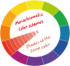
4. Monochromatic – Includes different shades and hues of the core color. This type of color scheme almost always gives beautiful results. But poor design might make things boring.
For businessmen who know less about colors and designs and more about customer needs, hiring a creative branding agency for this step would make sense.
Communicate with them what you know (about your customers and competitors).
And let the experts guide you about the right color combinations.
After you have the experts onboard and a color scheme ready, paint your brand.
From logos to websites, and from physical stores to packaging, make sure to maintain consistency in the colors that people get to associate with your brand.
But don’t consider this the end of the process.
Read More: What is branding and how much it costs?
Move with changing times to continue leveraging colors for brand building
Much like trends, color perceptions also change. Now you don’t have to change your brand’s color palette with every sway in color popularity. But don’t stagnate either.
Whether it is adding a new hue to your palette or moving a little away from your color palette for a special campaign, be open to options.
For example, Girls Who Code, an NPO working to promote women in technology, shifted to a simpler color scheme, by doing away with the contrasting yellow and using a bolder hue that attracts more attention. Kudos their brand strategy agency.
And with a branding design agency by your side, tweaking the designs and using trendy colors won’t be much of an issue for you either.
Now get ready to paint the market in the hues of your brand colors.