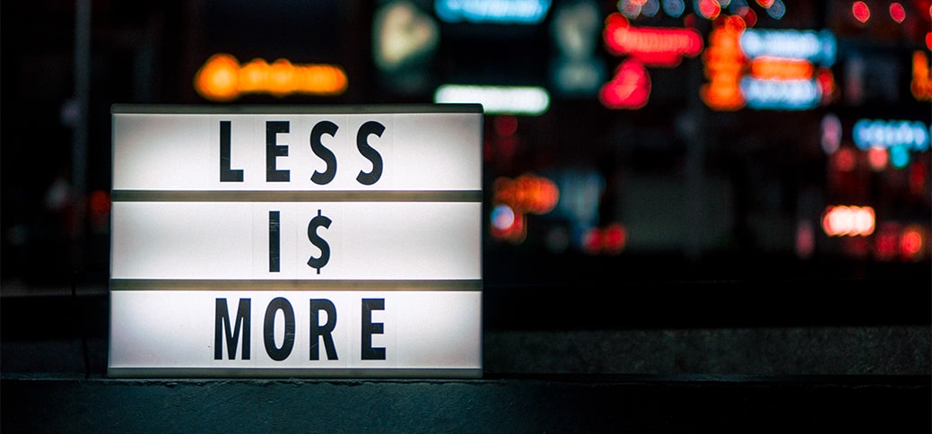
Minimalism or in simple words, the ‘Less is More’ design principle is ruling the digital world today.
Be it the Google homepage, Microsoft, or iPhone, most keep it simple.
But why? If we think about it from a psychological point, we can agree that anything that’s easy to understand and comprehend reaches its audience.
Along with that, here’s an interesting fact, according to George Miller’s Magic number 7 theory, the short-term memory of a human can remember only 7 elements of anything, plus or minus one or two.
Keeping this in mind and the fact that most digital users today access websites via a mobile phone, doesn’t a decluttered, easy-to-navigate website seem like the best solution?
Think about it, how simple is it to browse or search for anything on google?
The easy, simple website design keeps the user engaged with your website.
Less is More – But, is it?
If you are an Instagram user, you would have come across posts with white borders around them. This made the user’s account sophisticated and attractive.
Similarly, we’ve seen how magazines, newspapers, and social media play with white space and images to showcase content in an appealing manner.
So, if you are planning a website too, apply the below tricks are create an engaging experience for your user:
1. Include Organised Crisp Content
Brevity in your content will help you express more by saying less.
It can be as simple as – ‘Here’s what we do, how we do it, and here’s a sample’.
For a customer interested in your service, this is ample information for them to sign up to you.
- In a minimalist website, the textual content on the website is minimal, straightforward, and simple.
- Referring to Miller’s number 7 theory, you can also show your content in blocks for a visual effect.
- Bold San Serif fonts can be your go-to because of their simplicity.
- To keep your reader engaged, maintain the right flow of content.
- To effectively present content, writers and web designers write short crisp to-the-point introductions for websites.
- While composing your website content, use bold fonts and typography to establish visual focal points, this way you can direct your reader across your content.
2. The Colour Of Your Website Can Ignite Trust
Colour plays an important role in your website to maintain visual aesthetic and uniformity.
You can also manage your user’s attention by playing with colors and visual focus on your content.
While doing so, be cautious about the colors you pick. Most times, the colors we enjoy might not have the same pleasing effect when used on a website.
- In a minimalistic design, you are required to use one hue to draw attention without any additional design components or graphics.
- By using only one hue, you showcase a sense of energy and modernity while maintaining a minimalist color palette.
- As a minimalist, each of your color choices needs to be intentional to improve the overall user experience.
- Website designers also engage in color psychology as colors are often associated with emotions. Warm colors can provide your user with a comforting feeling while a cool color can bring a calming feel.
- Green, blue, yellow, and red are good colors to include on your website.
- This way you get to explore different perspectives and ideas to make your website more appealing creatively rather than using conventional methods of attractiveness.
3. Be Creative With Your Photos And Illustrations
Minimalism is all about simplicity but using fun images, graphics, and more help you engage your visitor visually.
The ‘less is more’ concept allows you and the designer to be creative. Because minimalism was never a mis-spelling of the word -B.O.R.E-.
It only meant go loud in little.
- The effective use of pictures and illustration helps you communicate your message without the overuse of words on your page.
- Minimalistic web design can be made dramatic by using large photos, or background pictures turning them into an aesthetic.
- To make it real and simple, avoid using busy pictures.
- The photos you use should suit the color tone, content, typography and most importantly, the ‘less is more’ approach.
- Also, while using animated pictures, avoid complex images or graphics, sharp transitions, and funky fonts. These usually disrupt the minimalistic theme.
Read More: How to create a strong digital brand with engaging site design?
4. Style Your Typography To Benefit The Reader
Typography includes the style, size, spacing, and other attributes giving words a style and personality.
- Effective use of typography makes your page look edgier and also increases its readability.
- This makes a website visually attractive and aesthetically pleasing.
- Minimalist fonts give high legibility. This makes it easier for the user to browse, read and also understand the content.
- Some of the trendy minimalistic fonts you can use are Chivo, Comfortaa Light, Lato, Nixie One, and more.
By playing with your typography using bold, italics, style size, and more your can establish a hierarchy of your message.
This can vividly help your user navigate and understand your product or service at ease.
Let’s just say sometimes you just need a wonderful and sometimes you need a WOW!
5. Use Effective Spacing & Web Navigation In Your Websites
Space or as the Japanese call it, negative space is the white space on your website. But, don’t by the name negative space as the website space is a web designer’s art brush.
- Space is used as the background for page layouts and website designs.
- Effective spacing helps in balancing the website elements.
- Minimalist web design focuses on using space to strike the right target audience.
- By rightly spacing elements you will be able to direct your viewer and create a visual balance. This implies that space amplifies the reader’s experience without tiring their eyes.
In other words, minimalist web designers craft inviting messages in a calming manner using space.
Speaking of website navigation, minimal navigation strives for a decluttered web design.
With easy yet appealing web navigation, web visitors can navigate and find blogs, e-mail signup pages, product listings, pricing, contact information, favorites, and more.
The reason a minimalistic design is preferred over others is that it’s user-friendly.
If you are working on your website with a minimalistic design, you will also be able to SEO optimize it in the future at ease.
This way, a minimalist website is an easy solution for both, the visitor and the website owner. Thus, making it a top trendy preference.

