Three interesting facts for you to ponder over:
- UX investments offer an ROI of 9,900%.
- 89% of customers buy from a competitor after a single poor user experience.
- 94% of first impressions about a website depend on the user experience.
Thus, you must have a strong command over user experience to offer the best. How to have such a command? How to know what users love? Take inspiration from websites acing their user experience design game, of course.
In the next five minutes, the article will share the 7 websites with stunning user experience designs.
7 most user friendly websites with stunning user experience
1. Medium
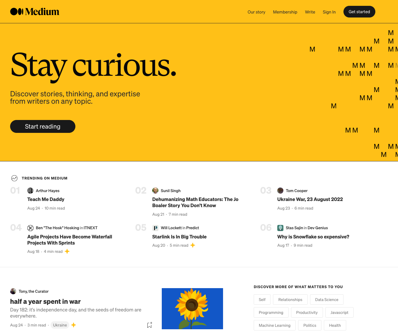
A well-chosen combination of typography. Minimal color usage. Adequate line spacing. That’s what makes Medium one of the best UX website designs services that build an instant connection with users.
When you log in, the minimalistic sidebar shows you the different features you can use while the existing and trending articles cover the rest of the page.
What we liked
- The one-column format to list articles makes information easy to swallow.
- The ‘Write here’ feature offers an almost empty white page. The feature removes clutter and helps users to do what they’re here to do; write.
- The website allows users to highlight and respond to specific sections of articles. Furthermore, each article shows the estimated read time, letting users know how much time they need to give to read the particular article.
2. Dropbox
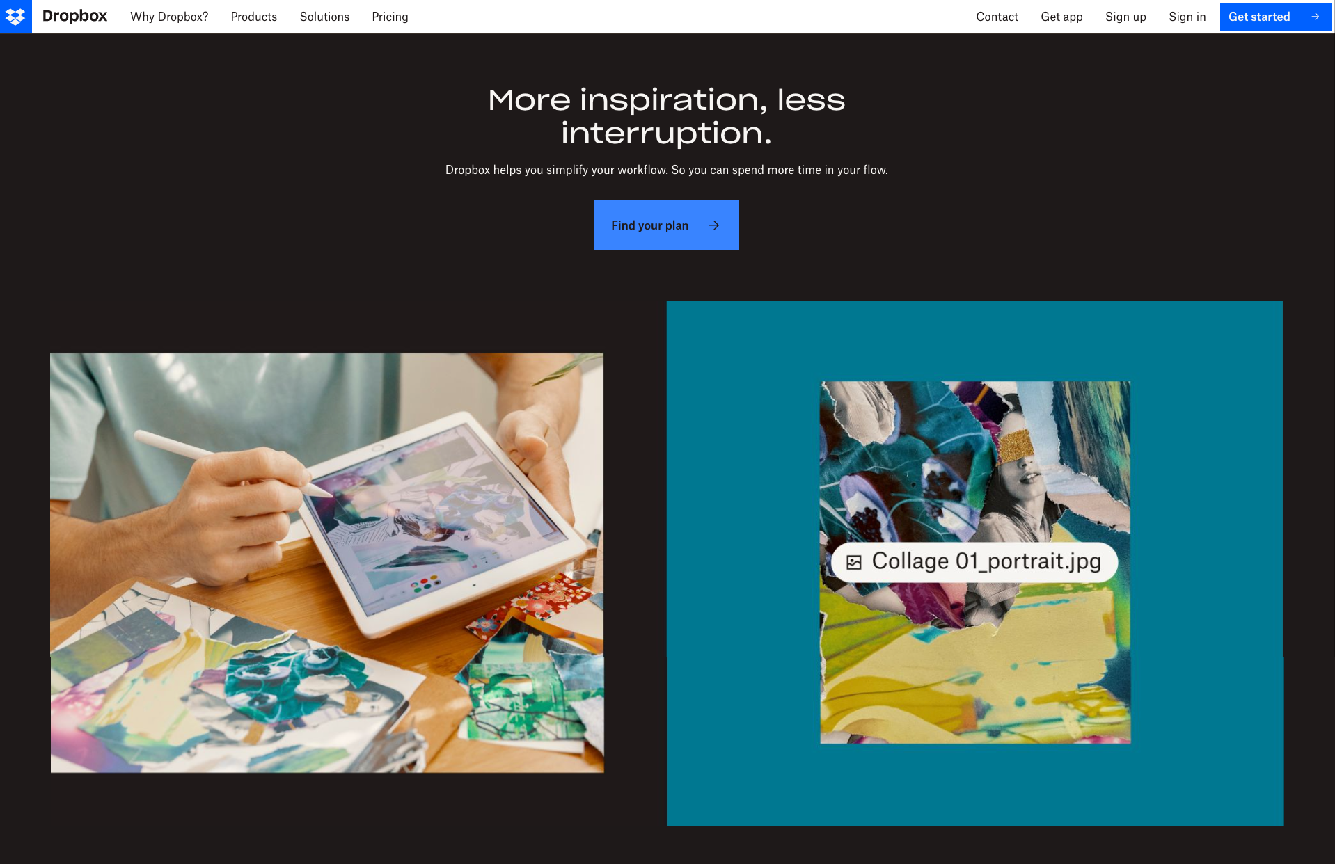
Dropbox is one of the best UX websites when it comes to a user interface that’s easy to navigate.
The drag-and-drop feature to add files directly from your desktop allows even beginners to use the website with ease.
What we liked
- The sequenced color palettes, lighthearted illustrations, and animated icons attract the users and make the user experience fun.
- The blog section offers a combination of experimental UI and multimedia which engages the audience. Furthermore, the featured section highlights content the users might be more interested in.
- The homepage offers detailed information on what Dropbox does, how you can use it, and even the third-party tools the website supports.
3. Google

If minimalism and fast load time are benchmarks of a good user experience design, Google is the pioneer at the same.
The feature is especially beneficial because a second delay in loading can cause the users to leave.
What we liked
- A huge search bar prompts users to do what they’re here to do — search for information.
- Information organized in different sections including news, images, and videos helps users to find what they need with ease.
- The option to use voice search offers a smooth user experience.
4. QuickBooks
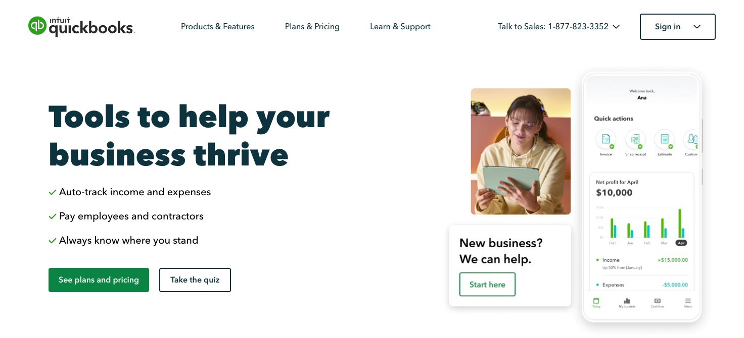
QuickBooks feature on this list thanks to the easy-to-navigate user interface the website offers. You can browse through the website even if you’re a beginner.
The USP of the homepage is the dashboard that offers a visual look of what features the user will receive and how the features will benefit the users.
What we liked
- A minimalistic taskbar showcasing the features, pricing plans, how to learn more about the tool, and get support.
- Popped out CTA buttons such as ‘Buy today and save 50% off’ prompting the user to take action.
- Information organized in specific sections so that the user can find the necessary information with ease.
5. Spotify

Spotify is one of the best UX design website examples available now; thanks to its well-planned flow and a consistent trail of appearance and behavior.
The features help even a beginner easily get a hang of the website.
What we liked
- A dark interface since its inception offers visual comfort, thereby increasing browsing time. Furthermore, the dark mode helps featured content, images, and buttons to stand out as well.
- Spaced-out lists, visually consistent grids, and soft-colored dividers offer a well-balanced visual hierarchy.
- Hover states and micro-interactions engage the user and let them know the website has received their input.
6. Duolingo
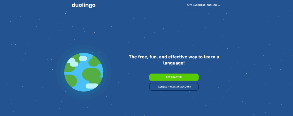
Responsive layouts. Customized learning experiences. Minimalist design. These features are what helped Duolingo earn a place as one of the best creative website UX designs.
Furthermore, the website offers a simple introduction process so users don’t get overwhelmed by the process.
What we liked
- The website asks one question at a time. The process lowers the cognitive load and offers clarity to users.
- The website breaks complex information into chewable pieces. Thus, the user experiences a simplified learning process.
- Quirky animation including a baby owl attracts the user and offers humor.
- Concise copy doesn’t bury the core message with fluff and guides the reader to action.
- Allows the user to browse through the website in 25 languages, thereby offering a smoother user experience.
7. Notion
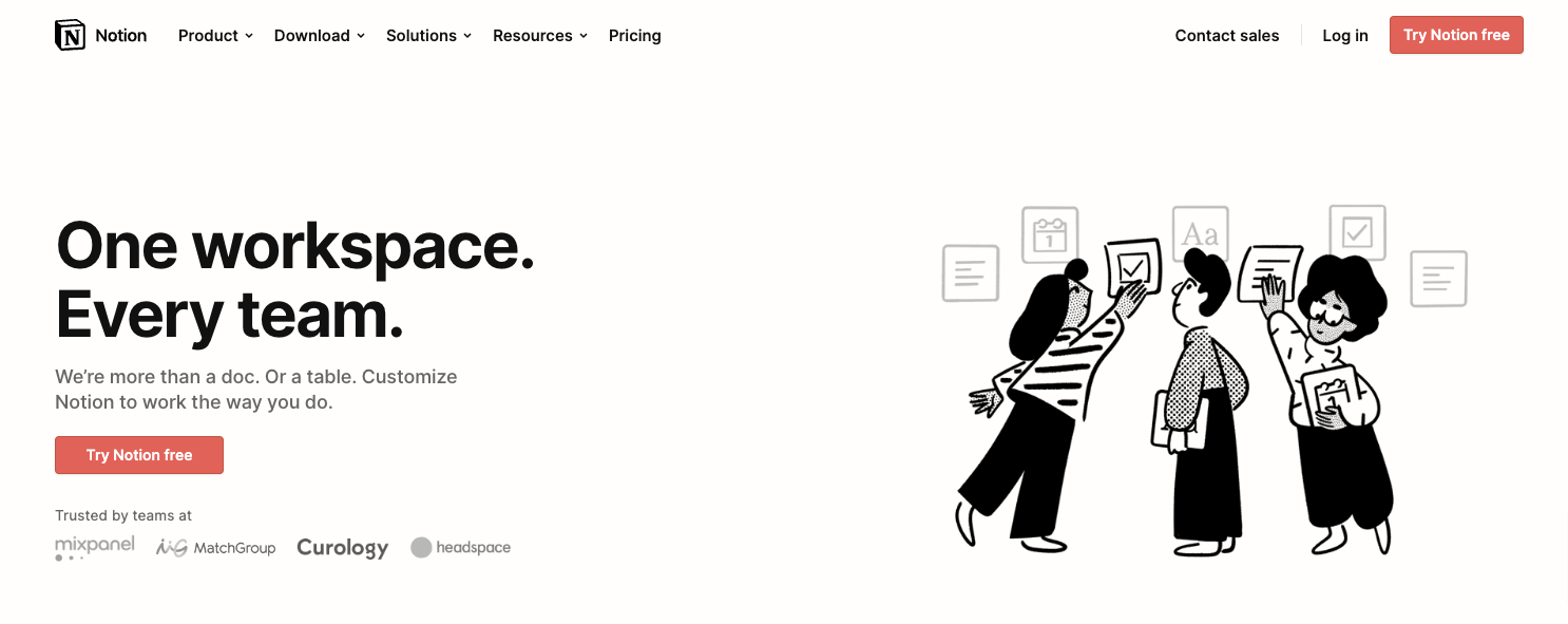
Notion is the go-to website to get UX design inspiration when it comes to showing the benefits users can receive from the website.
The website offers an interactive and step-by-step onboarding process that helps users know about the principal features of the tool and how to use them.
What we liked
- Interactive animations of how the tool works so the users understand the features with ease.
- Simple and direct CTAs prompt the user to take action. For example, the Sign-Up button is always available all the time for new visitors.
- Icons and illustrative overviews explain what each category means.
- An index and icons show which section the user is currently at.
8. Notion
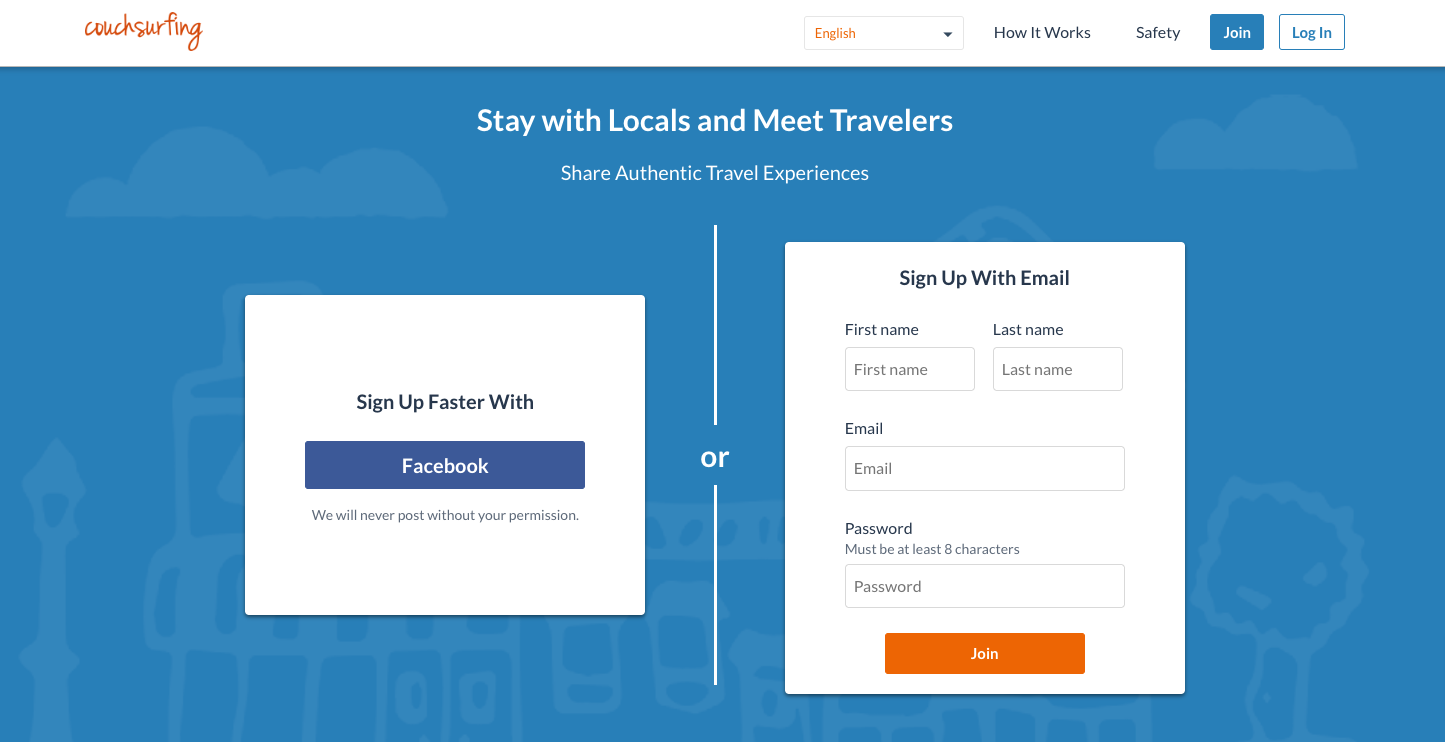
Couchsurfing has removed all the clutter to allow the users to focus on the principal goal; finding locals with accommodation to stay during their trip.
The users see two options to sign up; email or Facebook (brownie points for the lightning-fast process).
What we liked
- A search bar at the top left corner of the homepage allows users to search for accommodations with ease.
- Images to allow users to have a feel of the events.
- Detailed and easy-to-navigate information on hosts and travellers including photos and verification status.
Read More: This is how you are losing money with your bad design
9. Reserve America

Reserve America is one of the best examples of user experience design when it comes to emotional connection.
You see a big search bar that prompts you to search for places you want to travel to. Once you put in the destination name, the website redirects you to a map with pins of places you can stay in that area.
What we liked
- Resources on everything related to traveling such as hunting, fishing, camping, and hiking on the homepage.
- Images form a visual connection and offer users a feel of the destination.
- Option to find campsites near your location.
10. Khan Academy

Khan Academy does an exceptional job of maintaining the flow of the website while sharing lots of information.
Users can find a minimalist menu bar with the available courses and an option to donate. Furthermore, a search bar allows users to find out what they’re looking for with ease.
What we liked
- Specific sections talk about what Khan Academy does, why is it beneficial for the users, and testimonials from both students and teachers.
- Separate sections for learners, teachers, and parents so that no one gets overwhelmed with unnecessary information.
- Concise copy shows the users the benefits they receive and guides them to take action.
Websites with stunning user experience designs — up the conversion rate
A good user experience design services increases the conversion rate of a website by up to 200%. Thus, you must always track what the best in the industry are doing and try to emulate the same.
We hope the 7 websites with stunning user experience designs in this article offer enough information for you to offer the best possible user experience to your consumers.
